
🔎 TL;DR: I reimagined Popmenu’s campaign builder to guide users from “what do you want to promote?” to a ready-to-edit campaign in just a few clicks, making marketing simpler for busy restaurants.
Popmenu
Product Design
UI Design
Research
Usability Testing
Myself
Project Manager
Team of 5 Engineers
Popmenu empowers restaurants to manage their digital presence — from menus to marketing — in one place. But our campaign creation flow, originally designed for flexibility, had become overwhelming for many users.This project reimagined how restaurant owners could create and launch marketing campaigns across email, text, and social — with a focus on speed, clarity, and guidance.
Popmenu's original campaigns were disparate and disjointed. Emails, text messages, and social posts were three separate channels that had no overlap, and could not be sent, scheduled, or monitered in the same place.
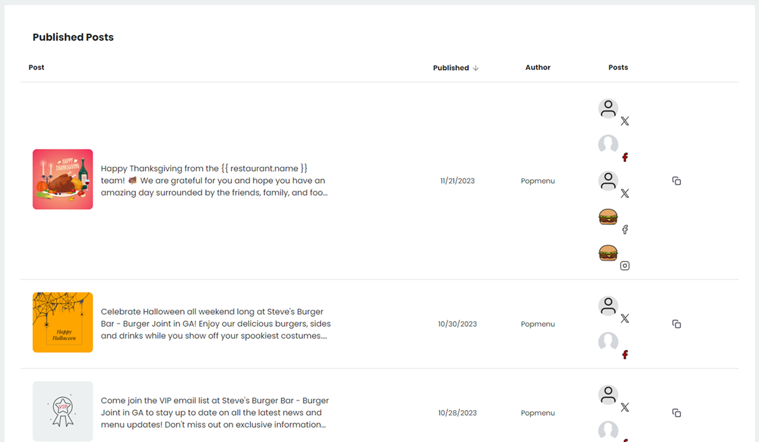
My first design pass addressed unifying all three channels of marketing into one campaigns umbrella, and allowing users to create and monitor their posts through one calendar or table.

Our next iteration needed to address two user groups' needs: quick creation and the ability to get guidance when needed.
The existing campaign tool dropped our users onto a blank page with too many decisions upfront. However, too much guidance slows down our marketing pros.
The goal:
🌸 Reduce the cognitive load of campaign setup
🌸 Make campaign creation feel guided, not gated
🌸 Balance speed and control for both novice and power users
“I’m not a marketer. I just need something that looks good and gets sent.”
— 🤷 Novice User, Popmenu Client
“I just want to get something out fast. It shouldn’t take 10 clicks to send a message.”
— 🦸 Power User, Popmenu Client
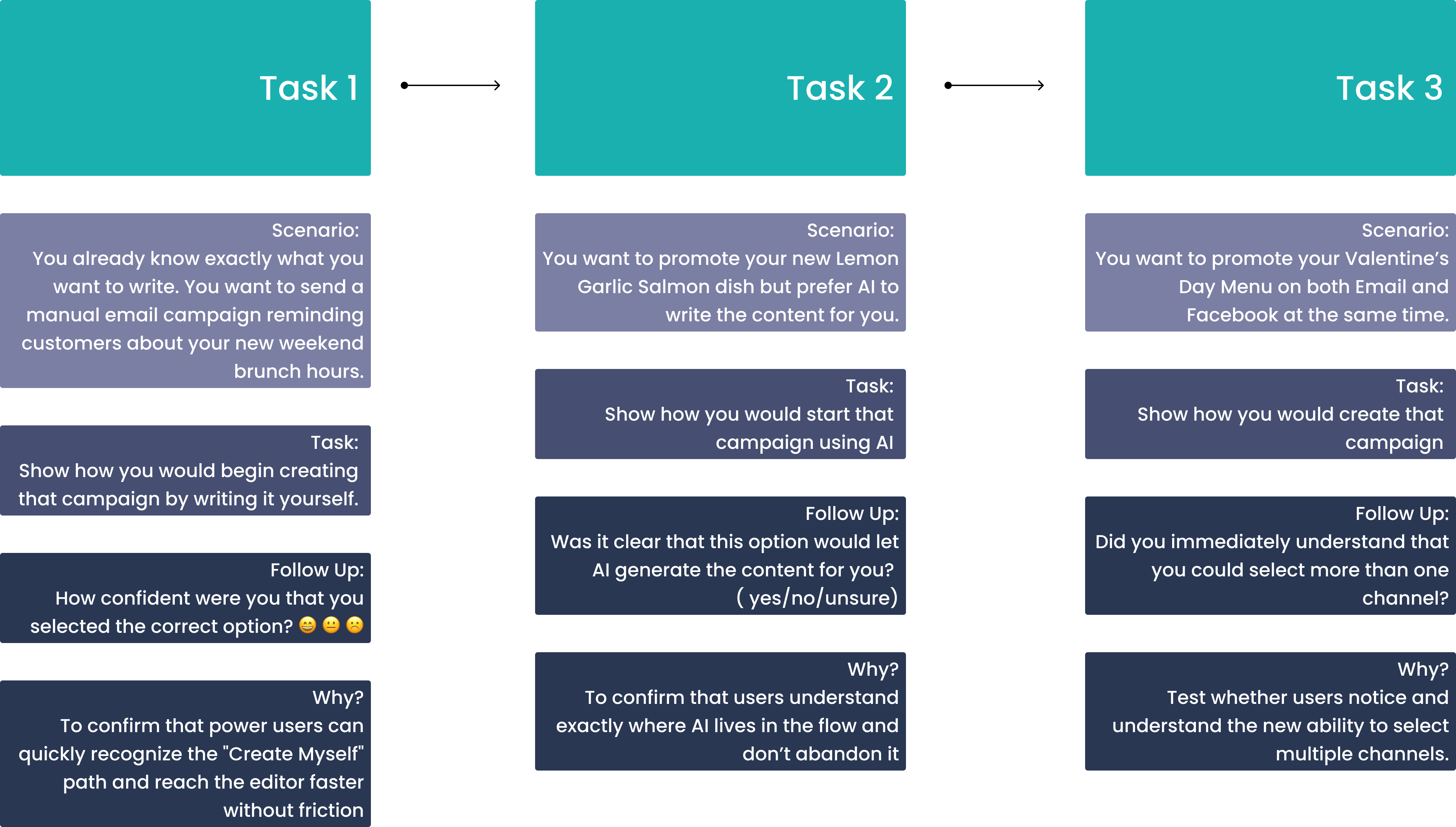
Before, users faced an unstructured path. They started on a blank page, unsure what to do next. Templates existed but weren’t personalized or organized. The system couldn’t distinguish between an email, text, or social post. Power users always found a way by pasting in ChatGPT and Canva content, but novice users were avoiding sending content all together.

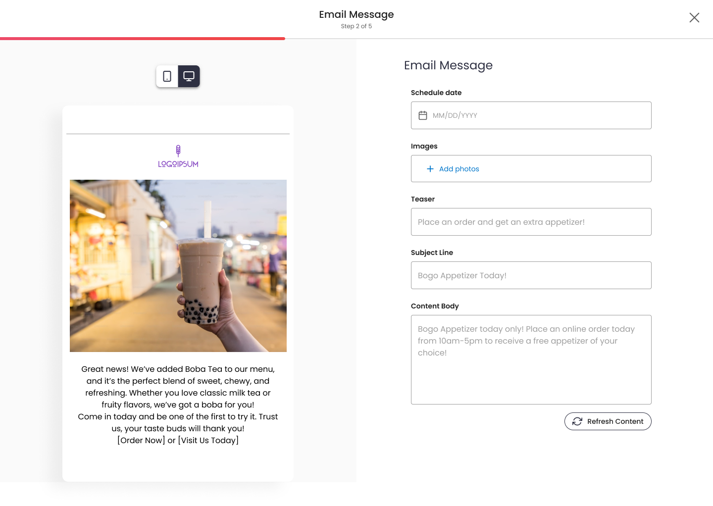
The existing “Create Campaign” flow focused on how users would build content (manual vs. automated), rather than what they wanted to communicate. We need to restructure the process around what the campaign is about.
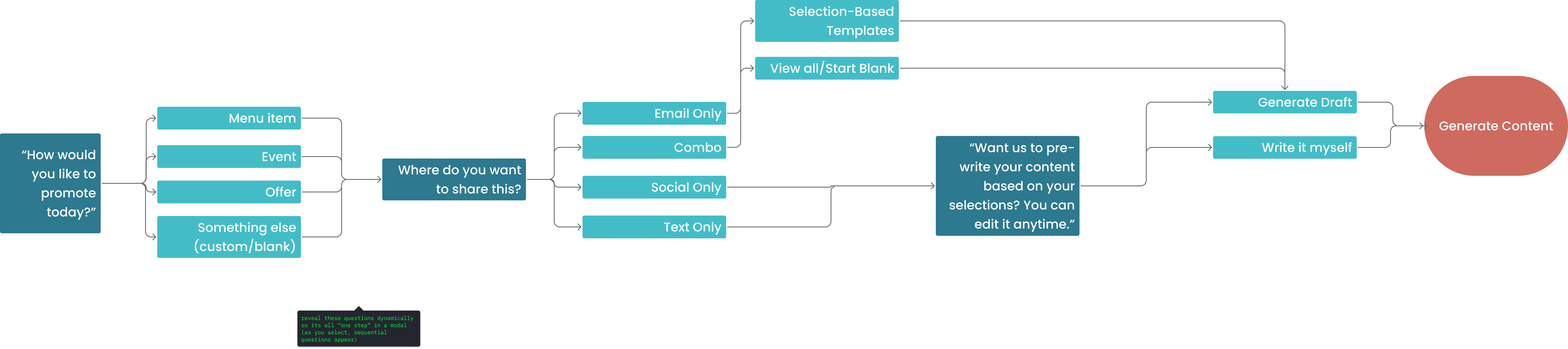
The new guided flow asks purpose-driven questions instead of tool-driven ones.
We reframed the problem: Instead of asking users what they wanted to build, we asked what they wanted to promote. That subtle shift in language made the process feel approachable and goal-oriented.
We tested two mental models internally-
🌸 Blank-first: Get to the builder in one click but require more setup later
🌸 Guided-first: Add more clarifying questions up front to reduce edits later.
While “blank-first” technically won on clicks, guided-first won on confidence and completion. Users felt the product was doing more of the work upfront.
🌸 Progressive Disclosure
Only show templates if the channel supports them
🌸 Goal-Oriented Copy
Replace “Create Campaign” with “What do you want to promote?”
🌸 Respect for User Modes
Novice users get guidance; power users can skip ahead
Key metrics include:
🌸 Drop-off between each step
🌸 Perceived control and confidence
🌸Task completion time
Future iterations may explore:
🌸Recommended templates based on past campaigns
🌸Personalized copy generation using historical brand tone
By reframing the experience around intent instead of medium, we’ve transformed campaign creation from a technical process into a conversational one. Users start with momentum and have the choice in what kind of experience they have.
This project pushed me to think beyond UX flows and into decision psychology. It's necessary to understanding when to ask users for input and when to make smart assumptions on their behalf. The result is an experience that feels guided but not forced.