
TLDR; Highlighting a restaurant tech company's value of marketing, ordering, and website tools. Creating an actionable, easily interpreted narrative anyone can skim and gain insight from.
Popmenu offers a robust suite of tools designed to help restaurants manage operations, grow their presence, and drive engagement. While clients are introduced to the full product offering during onboarding, we found that many users were unaware of the breadth and value of these tools after that initial touchpoint.
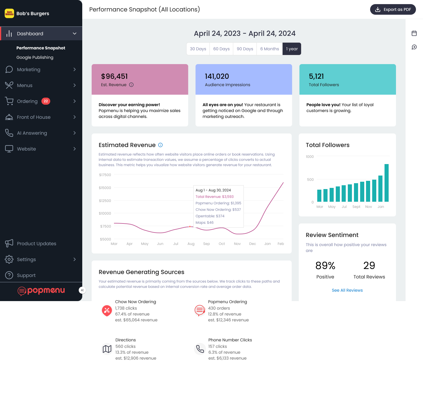
To address this, we set out to create a performance snapshot—an overview dashboard that not only makes key metrics visible at a glance, but also reinforces Popmenu’s position as both a management and marketing platform.Our goal was to create something that users would return to regularly—a starting point for action, not just a passive report.
The dashboard needed to strike a balance between clarity and depth. For busy restaurant owners, it had to be immediately understandable. For marketing managers, it had to provide enough insight to spark deeper analysis.
We prioritized:
-High-level data that tells a quick story
-Clear entry points for digging deeper
-Friendly, non-alarming language around negative trends
Importantly, we treated context as non-negotiable. Downtrends or plateaus are only meaningful if users understand what they mean—and what they can do about them.

Creating a Holistic Experience
The dashboard wasn’t just about data—it was about connection. We designed it as a hub, linking out to other tools and features across Popmenu. As additional dashboards (marketing, website, ordering) come online, the overview will serve as a launching point to those insights, supporting a more cohesive user journey.
Improving Feature Visibility
Many users weren’t aware of everything Popmenu could do. By surfacing stats tied directly to specific tools (e.g. marketing revenue, follower growth), we aimed to build awareness and increase adoption through organic discovery, not just education.
Multiple User Types, One Clear View
From hands-on owners to data-driven marketers, our users have very different goals and workflows. Designing for both meant finding the right level of granularity, and being deliberate about hierarchy and clarity. Every number needed to be meaningful at a glance, but expandable for those who wanted more.
This project was both foundational and fluid. While we were defining the overview dashboard, other specialized dashboards (like marketing and website) were also in development. At times, we were making decisions that would set precedents for data representation across the platform.
As a cross-functional team of designer, researcher, and product manager, our first task was to sort through wide-ranging input—from internal stakeholders, restaurant staff, and marketing teams—and shape a focused, first iteration. The scope was large, the timelines fast, and the needs evolving. We said that it was like building the plane while flying it—and it often felt that way.

Our first step was identifying the key categories of information that would provide a clear picture of performance. These eventually became:
-Website
-Marketing
-Online Ordering
From there, we collaborated closely with our data team to define what data points were available, what they meant, and why they mattered. We evaluated each candidate for its relevance, actionability, and alignment with our goals.
This prompted a critical shift in our framing. It wasn’t enough to display performance metrics—we needed to interpret them.
In response, we began exploring ways to inject thoughtful, human language into the experience. In our next iteration, each data card will include brief, narrative-style takeaways—contextual, celebratory, and action-oriented.
These messages help users immediately understand what’s going well, where they might focus their attention, and how Popmenu is supporting their growth. The cards also refresh daily, creating a reason for users to return regularly and reinforcing a habit of engagement with their performance data.

Not every feature in Popmenu’s suite is used universally. Website metrics and marketing campaign performance are dependent on client interaction and campaign activity. In contrast, online ordering is an opt-in feature—not enabled by default and not adopted by all users.
To address this, we added contextual intros for feature-specific cards. If a user hasn’t activated online ordering, for example, the dashboard displays a CTA encouraging setup or offering a demo. This allows the dashboard to act not only as a reporting tool, but also as a light-touch feature discovery surface, helping to drive awareness and adoption through relevance.

Key takeaways from this project:
Start with the story, not the chart- Data is only as useful as the story it tells. Framing information in a way that’s meaningful and actionable for users was just as critical as choosing the right metrics.
Context builds confidence- Restaurant owners don’t just want to see that numbers are up or down—they want to know why, what it means, and what they can do next. Providing that context helps transform insights into decisions.
Design for today, build for tomorrow- This dashboard had to meet current user needs while also anticipating future product expansion. Establishing scalable patterns and component reuse was a strategic investment.
As we move into the next phase of this work, our focus will be on deepening the dashboard’s value through personalization, interpretation, and tighter integration with other parts of the platform.
Planned next steps include intelligent insights, expanding data storytelling, and evolving cross-dashboard cohesion. As new dashboards (Marketing, Website, Online Ordering) evolve, we’ll continue aligning design patterns, terminology, and hierarchies to ensure consistency and clarity across the product.
This project was a reminder of the impact thoughtful UX can have when it connects the dots between data, design, and business value—and how even small, skimmable insights can make a big difference in a busy user’s day.